Data viz accessibility can be a challenge. This approach can help.
I often advise people and organizations on ways that they can publish and commuincate their data via the web. Especially for those in government organizations, they ask about accessibility.
The world of data visualization has for a long time concerned itself especially with colorblind acccessibility. When data viz takes place in a digital realm, it should give equal consideration to screenreader accessibility.
Summary:
- Properly formatted tables, with labeled headers and rows, offer better access to users with screen readers than charts or graphs do.
- Combining 'visualizations' optimized for each audience can provide the best experience
Many web visualizations are inaccessible
There are more technologies than ever to simply get data visualizations to the web. If you produce these visualizations - especially if you work for a government agency - you should also try to make these visualizations accessible to as many people as possible.
One challenging form of accessibility is accessibility for visually impaired users. Visualizations can help sighted users make sense of data, but charts are often inaccessible to people who use screenreaders (technologies that read the words of a webpage to users who are blind or visually impaired).
For visualizations from many web visualization technologies, a screenreader often reads off a list of values, without communicating what series or time period these values are for.
Increasing accessibility
Common ways to increase the accessibility of visualizations are:
- To provide a written description of the data
- To add alt-text to a visualization
- To make the data available for download
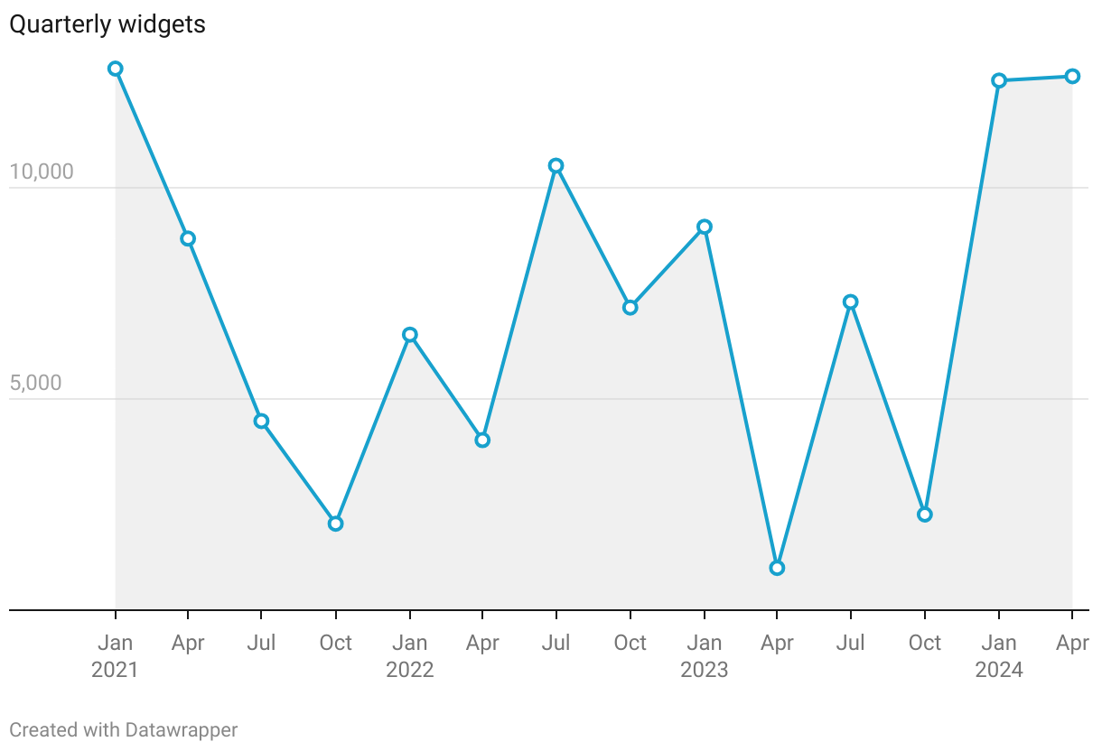
For example, alt-text on the visualization above might say, "A line chart showing quarterly widgets, from January 2021 to April 2024." One can enhance this to provide every single value, but in many visualizations and systems, it's not feasible to write every value in text, and frequent updates would be really hard.
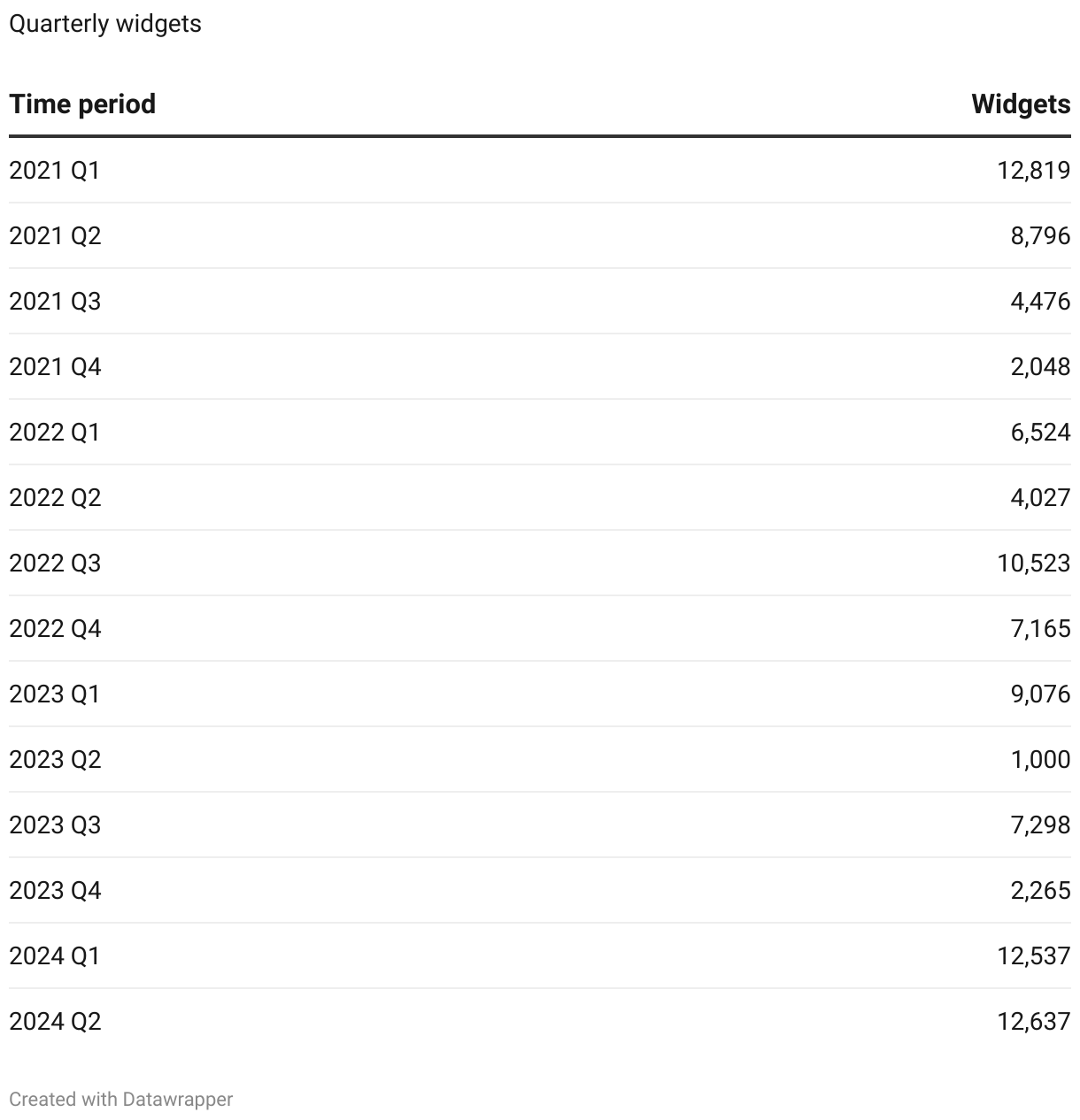
A better approach: properly-formatted tables
Screenreaders can navigate a properly-formatted HTML table in a way that preserves context: each datapoint essentially has x- and y-coordinates, the row and column labels. A screenreader will read these off to a user, so that the user always knows what a datapoint is for. Here is a table that corresponds to the above visualization.
Combining experiences
Simple web techniques can offer the optimal version for each user. Below, the visualization's embed code is inside of an element with aria-hidden="true". This prevents the screenreader from encountering this element and its contents when the screenreader is navigating the webpage.
<div class="visualization" aria-hidden="true">

  <!-- viz embed code -->
    <div style="min-height:442px" id="datawrapper-vis-GP4g4">
      <script type="text/javascript" defer
      src="https://datawrapper.dwcdn.net/GP4g4/embed.js"
      charset="utf-8" data-target="#datawrapper-vis-GP4g4"></script>
      <noscript>
      <img src="https://datawrapper.dwcdn.net/GP4g4/full.png"/>
      </noscript>
    </div>

</div>
Now, we can add the table to this, outside of the element with the aria-hidden="true" attribute.
<div class="visualization" aria-hidden="true">

  <!-- viz embed code -->
    ...embed code.

</div>

  <!-- Table embed code -->
    ...embed code.
This displays both the visualization and the table to sighted users, but 'hides' the visualization to screenreaders. From the code above, sighted users can see both the visualization and the table; the next thing we can do is add CSS that hides the table from sighted users.
<div class="visualization" aria-hidden="true">

  <!-- viz embed code -->
    ...embed code.

</div>

<div class="screenreader-only">
  <!-- Table embed code -->
    ...embed code.
</div>

<style>
  .screenreader-only {
    position: absolute; left: -9999px;
  }
</style>
Above, the accessible table is within a div with the class screenreader-only. We include CSS (inside the style tags at the bottom) that positions elements with this class far off the screen.
What does this look like?
If you are a sighted user, you'll only see the visualization. If you are visually-impaired or blind and are using a screenreader, you'll only encounter an accessible table.
While this demo uses embedded Datawrapper charts and tables embedded in the page, this approach will work with visualizations from any other platform - including using Javascript or other tools to create in-page HTML data tables.
Why do this?
When we create visualizations, we make the insights that data hold more apparent. It stands to reason that our purpose is to remove barriers to the data. Data visualiation has long concerned itself with
The "social model of disability" is a way of understanding 'disabilities' in the context of the world around them, and the extent to which the world around them turns their body into "able" or "disabled" by virtue of the barriers it erects for that body.
For example, a person who uses a wheelchair is only "disabled" if the world around them is full of stairs instead of ramps. The world renders them disabled by creating inaccessible spaces.
I invite you to build paths instead of barriers in data visualization.